Illustrated Vector Map
- Sep 20, 2021
- 3 min read
Updated: Dec 20, 2021
Pre-work


Attempt 1 Attempt 2
Attempt 1
For the first attempt where I drew a map of the residential area I currently live in, I couldn't find any particular memory attached to the locations I marked within the map. The overall atmosphere of the map felt detached from the mood I was planning to go for.
Attempt 2
Fukushima Shi is located in the Fukushima prefecture north of Tokyo, Japan. This area is relatively low in population density and rice paddy fields dot the area, setting apart households. I cherish the memories I have of spending my summer vacations in this place. I clearly remember the small park right across my grandparent's house and the large library connected to it from the back. There is only one drug store in the area with the largest parking lot. I also recall visiting the lunchbox vendor known as 'Mirai-ya' during the evenings for a snack.
Though our visits to Fukushima Shi have lessened after the Fukushima Daiichi Nuclear Disaster in 2011, I still carry strong memories of the place as somewhere I can be at peace and spend meaningful time with members of my family who live apart.
Stage 1- Make a Plan

Line drawing 1 :
- using curved corners to roads, to give a softer, peaceful appearance place
- using dotted lines and curved corners for natural features of the map.
- using dashes for the Matsu river to separate it from the other curvy lines representing the contours of its banks.
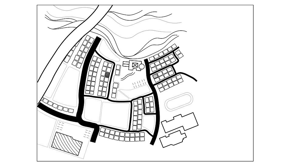
Line drawing 2 :
- In line drawing 2 some lines were made thicker to emphasize the landmarks :
+ the widest road on the left that leads to more populated areas with modern shopping departments and modern restaurants.
+ the home (grandparents’) where I stay when visiting
+ the drug store
+ the small park across the home
+ the vender
+ the learning center
+ the elementary school
Stage 2- Make the Icons

1. Home

- This icon for home represents the front gate of the traditional house. From what I can recall it is made of stone with a black marble plate with the households’ family name engraved into it common to old Japanese homes.
- I feel it is more relevant compared to the home icon in the 1st column. However, adding the thickness seen in the 1st icon on its outer lines may increase its clarity.
2. Learning centre/Library

- This icon for the Library represents the books you can borrow from the centre.
- Making the outer lines thicker for increase in clarity.
3. Drug store

- The visual of a pill for the icon represents the products available at the drug store.
- The icon was simpler and easier to understand that the 2nd column.
4. Oyama elementary school

- The reason for using a crayon as an icon was because crayons can be associated to stationary used by younger students (elementary).
- Increasing the thickness for outer lines for clarity and consistency with icons selected from 1st column.
5. Miraiya vender

- This icon represented their services better than the icon from column 1. The lunchbox visual represents the lunchboxes and light snacks they sell.
- Increasing the thickness for clarity and consistency.
6. Rice paddy fields

- This icon represents the pattern used in the paddy fields in the map.
- Though the icon is very simplified when compared to second option, the viewer can recognize the paddy fields by connecting the visual of this icon to the patterns on the map itself.
7. Matsu river

- The icon representing the river located behind the residential area.
- Increasing thickness in lines for better clarity and consistency.
8. Main road

- The icon represents the widest road in the area leading to more populated and modernized sections.
- The icon is more consistent with the above selections when compared to the 2nd option.
9. Park

- This visual of a tulip for this icon represents the flowers that grow around the borders of the park and to the entrance connecting to the learning centre.
- The choice of using a simple almost child like drawing of a tulip was an association made with the children that frequent their and my own memories playing them.
Final Icons

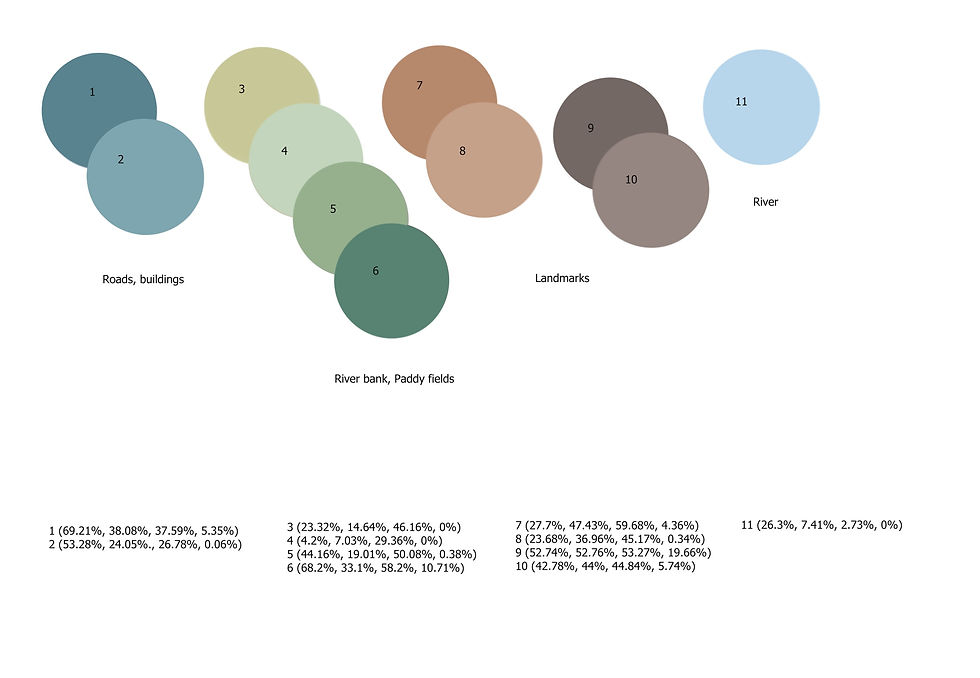
- Picking colors from the map for the icons, each icon match the colors of there landmarks. Green for parks and fields, orange for elementary school, etc.
- The icons I had chosen were in different thickness so changing of all the icons to stroke of 1.5-2px for more consistency.
Stage 3- Colour
Colour scheme 1

Colour scheme 2
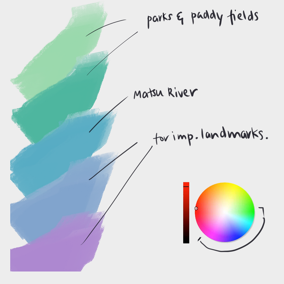
Final Colours
Stage 4- Final

Comments